# Infocards
Infocards are discrete pieces of information about a resource. When grouped together in certain ways, they constitute a particular use case. We have assembled some common use cases for you under the Use Cases menu, but you can also create your own groupings with saved searches.
# Anatomy of an Infocard
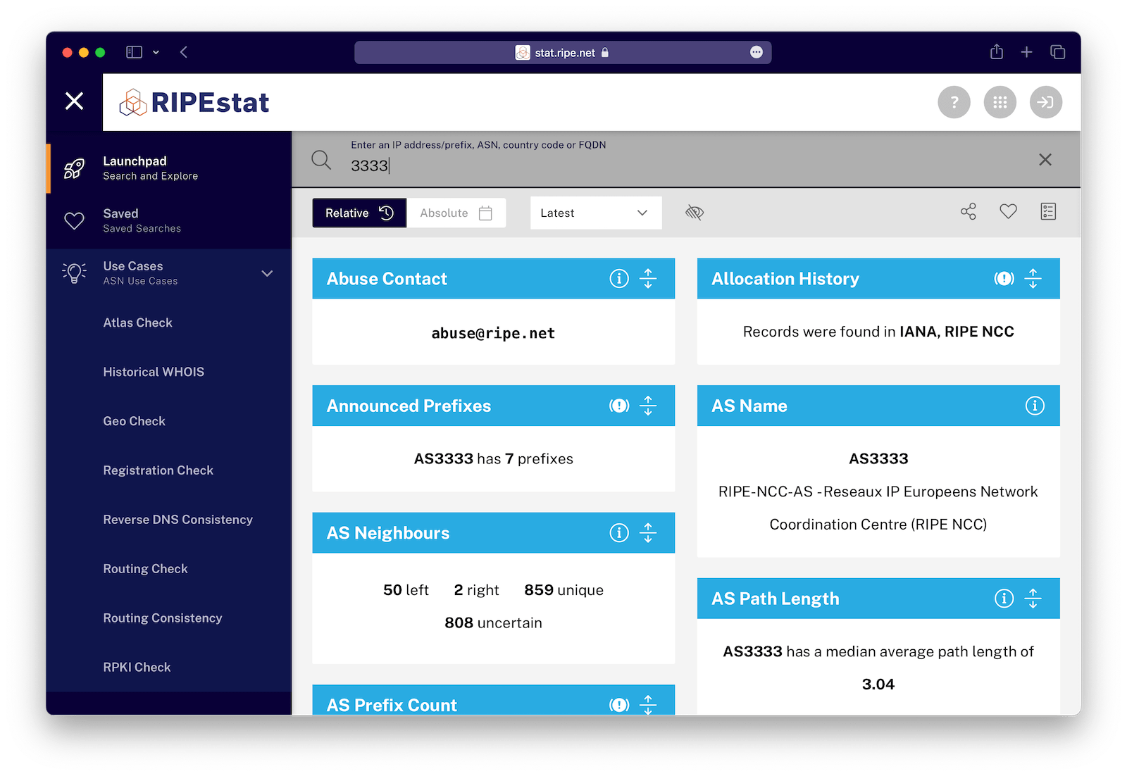
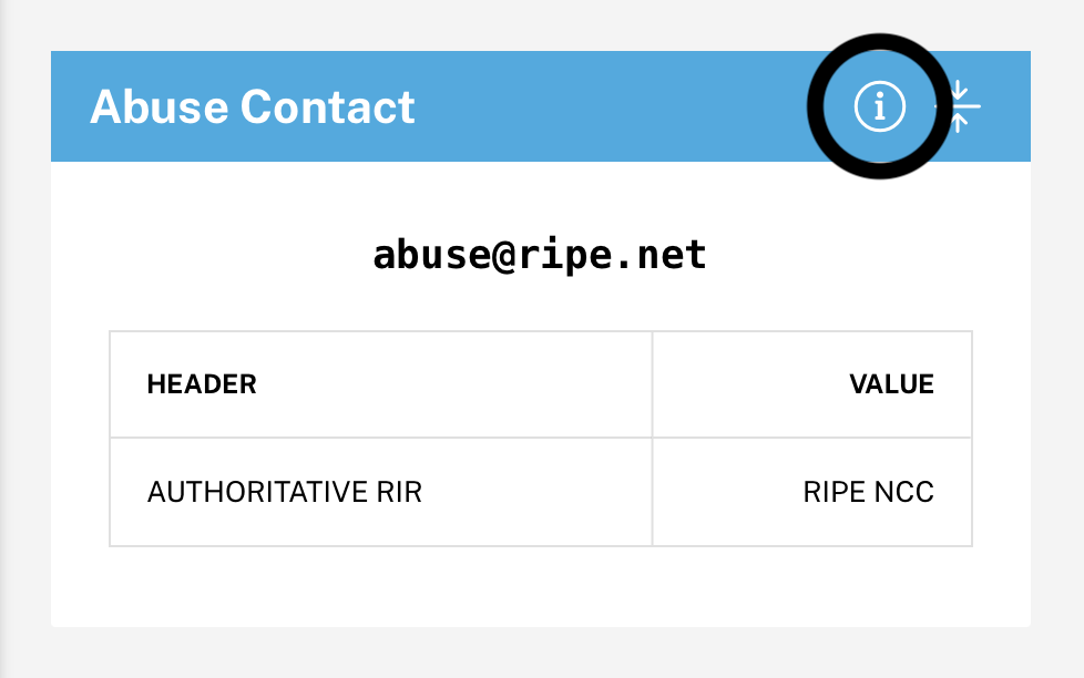
Each infocard consists of a titlebar and a content area. The titlebar contains the title as well as close button (on hover) and info button.
# Titlebar
You can use the titlebar to:
- Drag the infocard to another location relative to its sibling cards
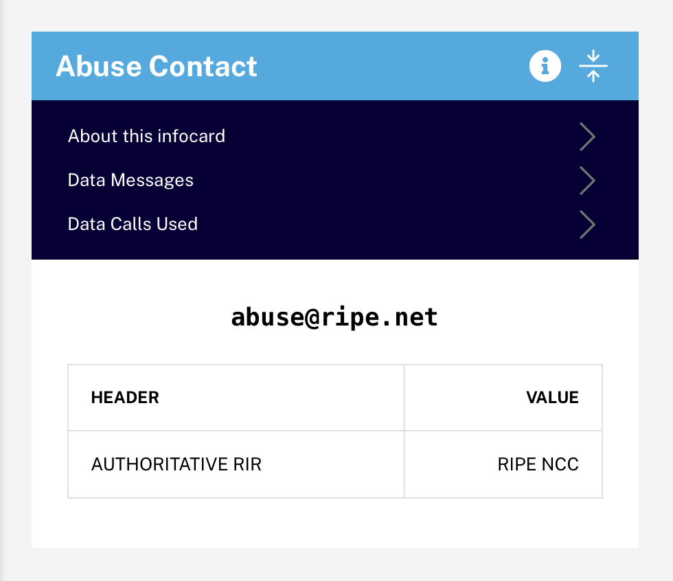
- Display or hide info about the card and its data
- Show or hide (expand/contract) more information of the card (if any)
- Hide the card (when hovering, an "x" will appear that when clicked on will hide the infocard)
# Content area
The main content area will generally show a short summary line about the queried resource. If there is more detailed information, it can be revealed by clicking the expand button in the titlebar.